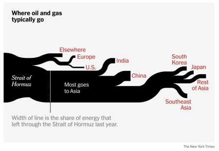
I took one look at the top infographic from the NYT on where all the oil goes from the Strait of Hormuz and I immediately thought of Charles Minard’s classic graphic showing Napoleon’s losses during the Russian campaign of 1812 (see below). … The Times deserves credit for using a Minard-like approach to conveying information about the strait. It works. But its graphic should be horizontal, as pictured above and on its web homepage, not vertical, as in the actual article.
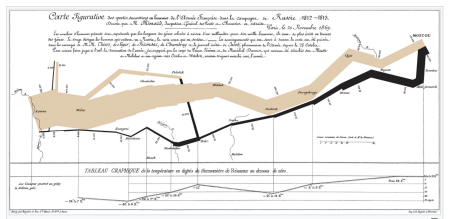
Re Minard’s legendary graphic: the beige line at the left conveys how many troops Napoleon had when he launched his attack on Russia – and how dramatically his army had thinned by the time he got to Moscow. The black line, running right to left, shows Napoleon’s retreat from Moscow and his steady loss of troops till he got back to France with only a fraction of his original army. As the Wikipedia entry notes: “Statistician professor Edward Tufts described the graphic as what ‘may well be the best statistical graphic ever drawn.’”