.
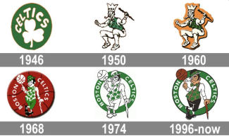
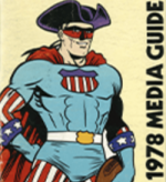
After making my bold first-round Celtics playoffs prediction, I stumbled upon these old Celtics logos. I don’t recall ever seeing the jaw-droppingly bad 1950 and 1960 logos. … For obvious reasons, Celts fans seem to have purged them from collective memory. … But is the 1950-1960 Celts logo (we’ll count ‘em as one from here on) the all-time worst Boston sports team logo? The 1950s Red Sox logo is indeed pretty disturbing. … And the little-known Pats tri-corn hat logo from 1960 and the dead-on-arrival ‘Super Patriot’ logo (scroll down) from 1979 are both pretty damn wretched. …
So which among them is the worst? The Sox’s ‘50s logo is arguably so bad it’s good. The Celts 1950-1960 logo is just plain bad. So it comes down to the Pats’ tri-corn hat or Super Patriot. The tri-corn hat looks like a Batman logo, making it an obvious strong contender for worst Boston logo ever. But I’m going with the trial-balloon Super Patriot. How bad is it? Fans voted for Pat Patriot over Super Patriot during a half-time logo contest in 1979. It’s that bad. And it’s shocking Billy Sullivan even considered it as a logo. … Btw: I’ve also never been a big fan of Pat Patriot or the current Pats logo. … Btw II: the Bruins have a record of handsome, understated logos. Good for them.


